IU Football (helmet) Mania: Catch it!
It's the summer...It's sometimes difficult to find Purdue stuff to write about...but when a Purdue opponent or rival does something entertaining, we gotta give it a look.
Yesterday, a video of IU's players watching the unveiling of their FIVE new helmets was launched into the interwebnet ether and it became a Twitter hit. That's right, Coach Wilson wanted to give his players one helmet for every win over the past two seasons as a well-earned reward...and the end result is entertaining.
Before I get into my biased look at IU's new looks, lemme say one thing in all seriousness- Fred Glass got part of this right, yet again. He's doing everything he can to generate interest and energy into a sleepy football program...they've invested money, tried to innovate and have marketed a decidedly lousy product as much as possible. And there have been more than fifty or sixty people in IU's Memorial Stadium...so his efforts aren't in vain. But a few of these helmets are simply stabs in the dark.
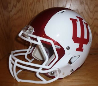
The first option is what IU has had the last few seasons- crimson helmet, white "IU" and facemask.
The next one is pretty solid:
This design plays on the EVO Speed helmet's chiseled details...it looks modern and isn't too goofy really.
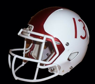
Option 3 gets a touch goofy:
A tip of the cap to IU's rich football heritage; numbers on the helmets are pretty classic. BUT, if you're already not making the helmet truly retro, why not have the numbers match those on the jerseys? I'm being nit-picky, so I'll move on.
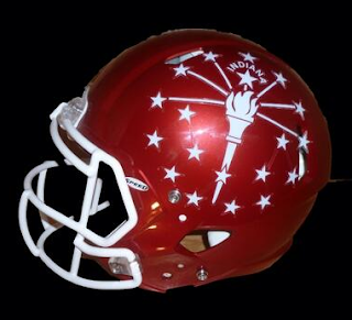
Option 4 is pretty horrible:
That's the state of Indiana's seal...in the wrong colors...on a helmet.
This is a bad design.
I know, I know, Maryland put their state seal on their helmet...I really liked that. BUT, they wen't over-the-top with it, which made it pretty cool. PLUS, Maryland's state seal is a much stronger, more-athletic graphic. Atop of that, Indiana's state flag is blue and yellow, not red/white, of course. (note: Indiana's state flag was also in some of the 90s Batman movies as Gotham's City flag.)
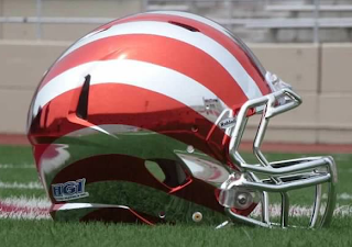
The last option is the best/worst; depending on your perspective.
But before I do my big reveal, lemme lay some groundwork. Someone decided it'd be best to focus even more on basketball during football season in an effort to tug on the heart strings of IU's fanbase. The problem is, most of these folks will be watching UND on the Saturday that IU wears their gaudy new chapeaus. The five or ten IU alums that actually root for IU's football team probably appreciate this...but I'd think the purists would want to: A. keep the stripes red and white B. Not bastardize the stripes this way C. Pay homage in a more fitting way...So I wanted to help.
But before I give them a hand, here is that fifth option:
When I first saw the helmet, I thought this was Adidas' doing. But I'm not so sure now. Adidas would be a fair fall guy; they did some truly heinous things with Michigan, UND, Nebraska and Wisconsin's unis last season...But a couple things are wrong with that theory- First, that would point to Adidas actually caring about IU's football program...that's doubtful. The bluebloods that Adidas shat upon last year were all full head-to-toe, single-game changes. This isn't a full uniform change, just lids.
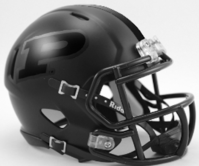
One one hand, I get it- Kids really like new helmets; that can be a recruiting tool...You guys all know that I'd like to see Purdue do a single game alternate black helmet. Plus, and even more than Purdue, IU doesn't have much football heritage or tradition...so the shackles are off. No design rules really because none of the hundred fans in the seats will be offended either way.
I think I found the guy who is behind some of these designs...and I don't blame him for this. He's got some good ideas...and the red/chrome helmet wasn't his (which I'd brag about, if I were him).
And speaking of that chrome design, J summed it up best last night on Twitter when he said he hopes IU wears the mirrored finish helmets v. Purdue...so Purdue's players can see themselves knocking the crap out of IU in real time.
Until IU can climb the highest mountain yet again and reach that elusive six-win mark (something Danny Hope accomplished twice in the last two years; and was subsequently fired for)...this is all sizzle, no steak. Memorial Stadium's re-fresh is pretty solid and looks great...but with 1-5 wins/season and no one in the stands, it seems like a waste of money and time; the same goes for these helmets.
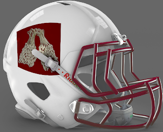
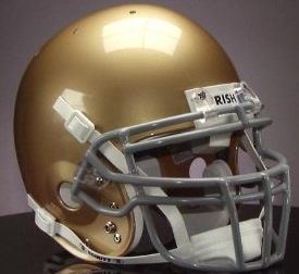
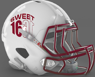
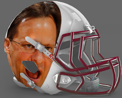
So for that handful of IU fans that actually know IU has a football team, here's my gift to you: The basketball homage football helmets you WISH they would have made...
This one's called "Cut 'em down"...
Next up, something more familiar and closer to most IU fans' hearts; it's called "Goldy":
My option three commemorates back-to-back Sweet 16s...Almost called it twin rings...or simply, "The Movement":
And finally, if IU fans like over-the-top, they'll love this. It'll scare the crap out of opposition with its intensity...plus, the forehead is so shiny that the glare will distract opposing DBs as IU's QBs rain mad fire down on their opponents:
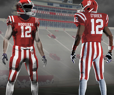
In closing, as Purdue fans, we should give IU some credit for the shiny striped helmet. They did something that is completely unique to their university...unlike so many of the astroturf traditions that have popped up in the last decade around IU's football program...PLUS, they did something we want Purdue's football program to do- take a small risk and give the team a new look. So hats off for that. PLUS, they stayed pretty close to their school colors...something they didn't do the last time they significantly changed their helmets.
As one of IU's alums, Tim O'Brien says, why not just just go all-in with the concept???
We agree with Tim...this would be unspeakably-awesome...DO IT, FREDDY!!!
But they really didn't expect us to sit idly and say nothing, did they?
Until Purdue takes the next step, we can continue to dream...
