Nike doing what Nike does.
 |
| 1979 |
Professionally, I've been in the footwear and athletic product business since 1997. I grew up drawing Nike, Adidas and Reebok basketball shoes as a kid (along with planes, buildings and cars). But my passion for shoe design became the way I make money...I'm blessed for that.
At one point, I had about 50 pairs of shoes...most of them were Nike...after purging my collection during my time at one of their competitors in the late 90s, I became a consultant...a perpetual free agent, if you will...so I started collecting, and re-collecting Jordans and classic shoes that I once really liked. Everything from the AJ III (I've had six pairs of these since they originally came out) to Nike Air Max 95s to Nike Dunks that were as close to those that my Boilers wore back in the 80s as I could find.
I grew up pretty brainwashed by the swoosh...as have many of you. I still love Nike gear...and think every now and again (about every two years), they seem to put something on the market that's truly revolutionary for the industry. BUT, a lot about that brand and its tactics do little more than anger me.
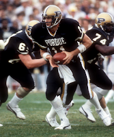 |
| 1984 |
A few years ago, I noticed that many of the shoes that I had purchased over a decade period had all be re-re-released...the market was flooded with retros. Not just Jordans, but Flight '95s, original Air Max, Revolutions...My collection became boring and seemed like it was little more than a dust collector. So I liquidated it via an online auction site. As I looked at my office wall that no longer had Jumpmans and swooshes on it, but just had logos of companies I had done business with, I felt liberated.
Maybe having two kids had changed my perspective...or maybe visiting the factories that churn out "limited" edition shoes by the thousands gave me pause. Whatever the case, I'm no longer a sneaker head...just a guy in the industry.
But before I liked drawing shoes, I loved Purdue. When I was a kid, Purdue's helmets were a very dark gold color- kind of a shiny bronze, really...but they didn't seem gold, at least to me. But finding gold unis that weren't brown seemed like a bit of a struggle for the athletic department.
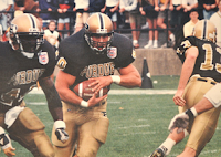 |
| 1995...old gold |
As the 80s progressed, the gold got a bit brighter. By the mid 90s, Purdue was truly metallic gold. But, the licensing department felt like it had lost some control of the colors. To tidy up the brand identity, they reigned in the colors to name Vegas Gold as the official color. No longer could you find mustard, goldenrod or yellow Purdue shirts in the stores...Purdue's official color was its color. A lot of older alums didn't like it too much either.
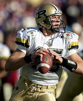 |
| 2001...Vegas gold |
But as time progressed, Purdue's colors went from gold to a metallic beige or urine color. For a long time, I thought the blame was solely on my alma mater...but this past year, I learned a little secret- Nike doesn't give a damn about Purdue...as if there was ever any doubt about that.
A few seasons back, Purdue wanted to honor the '67 Rose Bowl team with retro unis. Nike gave them two options: use the existing gold (sucks) OR use Missouri's darker gold. Since they had that material lying around, they'd allow Purdue to use it. Nice of them. Purdue chose to go the cheap route and use Mizzou's gold- not too far off from the '67 team's color...but not quite right. No matter, it was just one game.
This past year, I went to a Lids sale on Indy's West side. they had piles of "Vegas" gold and black dummies. Golf shirts, jackets, shorts, t-shirts...I thought I'd find Purdue logos on them since I was in Indianapolis. But, the only logo on the apparel was the Swoosh. Lids takes generic pale beige coaches shirts, t-shirts and hats with the swoosh and makes them into Purdue's.
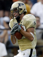 |
| 2002...beige era begins |
So Purdue, Wake Forest, Georgia Tech, Vanderbilt, and other schools are all wearing the same stuff. The fans have kinda been duped. The colors that we thought were ours, are really Nike's. Nike calls the shots...and Purdue seems to just accept it.
The redesign of the train is a case in point. Nike didn't like that the train wasn't symmetrical...for years they had expressed that it needed to be changed...you know, to help them out. So Nike redesigned the train to fit their template...to make it easier on them- And Purdue's licensing department took this backhanded gift with a smile. Everything Nike does is in Nike's best interests.
Now, it's not completely Nike's fault that all of this happens. Purdue's athletic and licensing department seems to be quite content to be their dance partner and enabler.
As many teams in the top-25 were wearing the watermarked basketball uniforms four or five seasons ago, Purdue wasn't. The little team out of West Lafayette wasn't a priority for Nike. But, when about every team in the top-50 started doing it a season ago, Nike allowed Purdue to come along. But it really wasn't too cool at that point...just something Nike blessed in an effort to make sure basketball fans knew who was wearing Nike threads.
 |
| At least the jerseys are black |
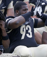
Today, on media day, the football team sported slightly-altered uniforms from last year with the new train near the base of the neck. And Purdue's pre-season All-American flashed the shiny-palmed gloves to the cameras. As Boise State, Army, Navy, MSU, Georgia, TA&M and the nation's perennially-elite have gloves with their school's logo on the palms, Purdue gets to pimp the Swoosh a bit more as "Nike" is on Purdue's palms.
But worse than the gloves...which are pretty played out already, Purdue's pants are little more than just really tight, pale, khaki pants.
As Nike continues to customize NCAA football uniforms, less-legible, more-rounded numbers are showing up more and more, and more teams are losing their identity as they take what Nike deems as appropriate. At least Purdue already has black in its uniform...Oregon, Georgia, FSU, Kentucky, Arizona State, Stanford, Rutgers, Texas and many other schools have all thrown out school spirit in favor of Nike's agenda of completely white-washing the landscape of college sports (ironically in shades of gray and black)...one ugly uniform redesign at a time.