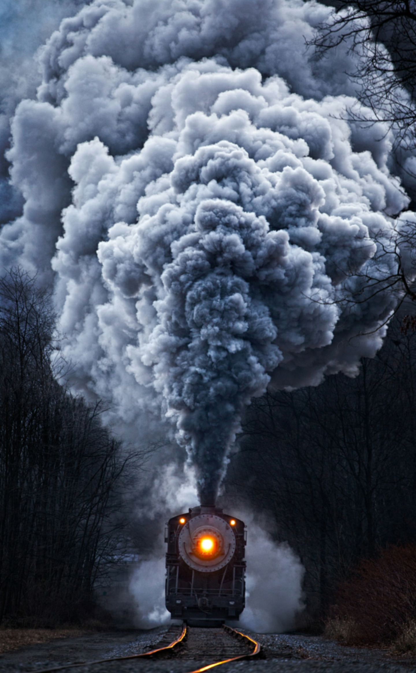
If you break down the old motion train, from a visual standpoint, there's room for revision. The perspective doesn't line up well, and there are some issues in the mark that make it kind of tough to love. But, I've always, at least, liked it.
I've worked on the licensing side of the business with Purdue...and understand a bit of what Nike's problem with the old train was. It's not a balanced shape, so it's tough to center on hats and shirts and its sharp tail makes it hard to fit onto sleeves and things of that nature. So, I get why Nike would want a revised logo. I also understand that if the athletic department has to pay $0 for a revised logo, they'll probably jump at that.
But, the new train that Nike is forcing upon Purdue fans leaves a lot to be desired. It's designed kind of lazy in that it's not only balanced, but completely symmetrical (the smoke specifically). But, much worse, the smoke seems to form a very veiny phallic shape...which is nothing but negative, from my perspective...and if it's not a joke being played on Purdue, it's laziness, once again, that let it by.
I'm a person that hates criticism without a solution being offered...so simply, here is my quick solution- Change the smoke and add the motion P to the front, and I think Nike might have a winner. As of this morning, in the BTN poll, over 80% of the fans who looked at the new mark disapproved of it...
Here's my solution:
Thoughts?


